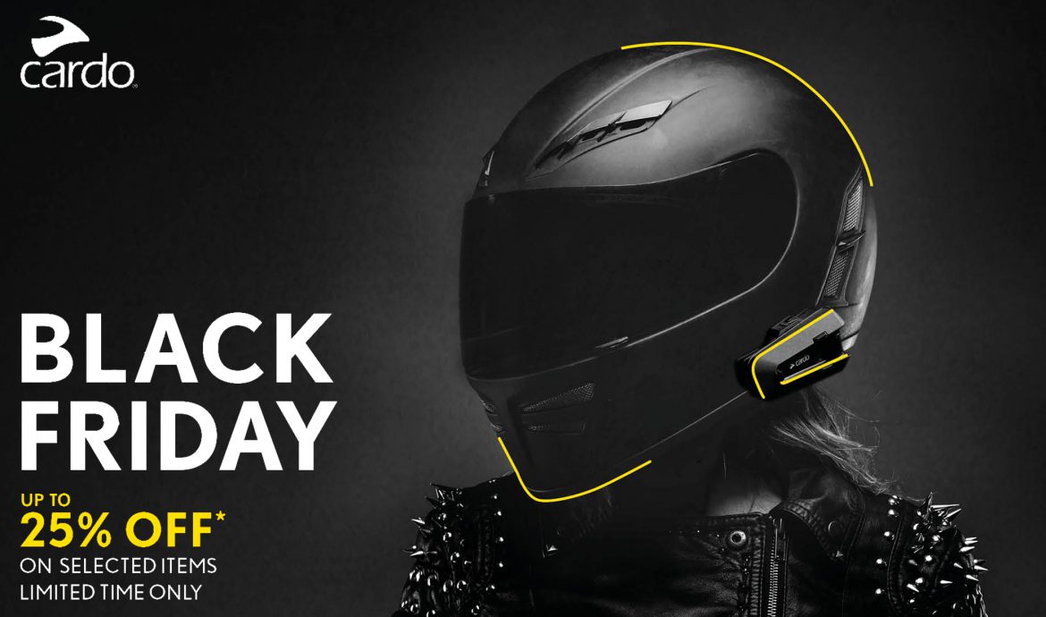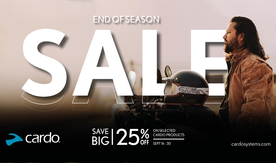
As a global company, we align our campaigns with worldwide trends. While some regions may just be starting their riding season, our focus was on showcasing the excitement of our End of Season Sale.
THE IDEA
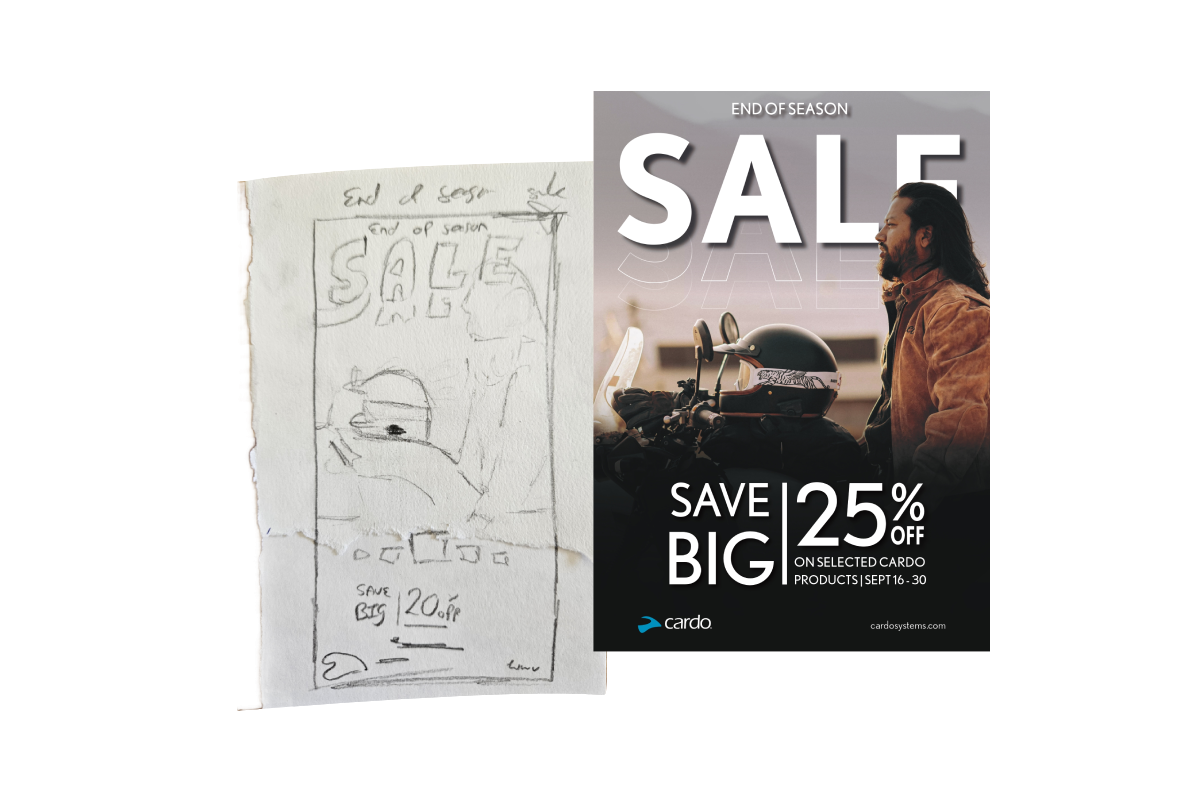
From the start, I had a clear vision of how this campaign should look. The colours, imagery, and text were already vivid in my mind—almost like a mental snapshot. The next step was bringing it to life. I quickly sketched out my concept in my notebook and passed it on to the studio team.
The idea centred around a rider sitting on their bike, viewed from the side. The helmet was placed on the tank with the device subtly visible, creating a focal point. The colours leaned into an autumnal palette, perfectly aligning with the season and the End of Season Sale. As for the text, I imagined it interacting with the imagery. A bold but partial overlay that added to the dynamic feel of the design.
The studio got straight to work, and while a few alternative concepts were explored, my original idea ultimately became the heart of the campaign. Seeing my vision fully realized, and approved by the head of marketing, was an incredibly rewarding experience. There’s something truly special about watching an idea that began as a quick sketch evolve into a key visual for a global campaign.
THE RESULTS
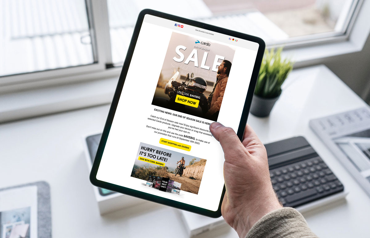
Unlike other campaigns, we didn’t need as many assets for this sale. The focus was on the poster, social media & Google banners, and of course, our newsletter.
See my full portfolio here.
