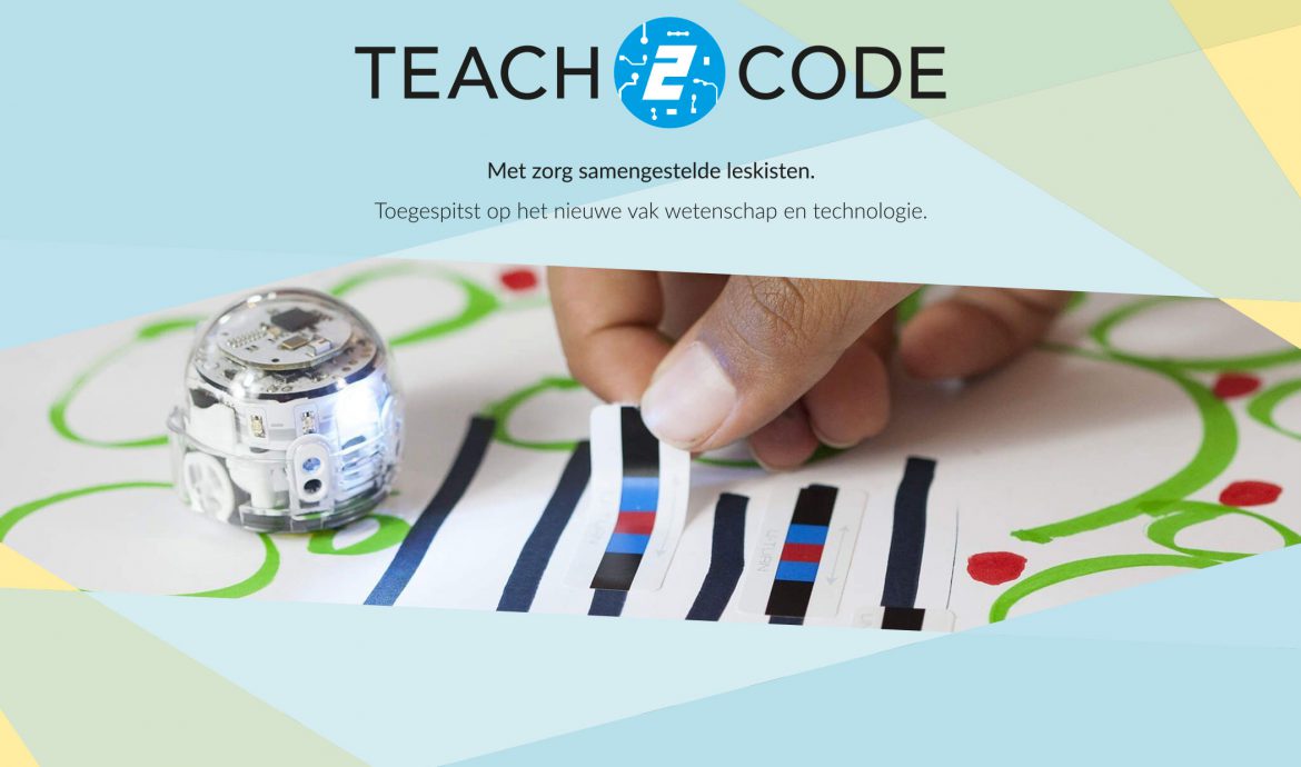
Whilst working for a Dutch importer, I had the opportunity to work on an exciting brand called Teach2Code. This in-house created teaching platform offered schools materials to teach programming from an early age.
THE PRODUCT
The company I worked for created Teach2Code as one of its products. Offering ready-made programming lesson packages to the educational market. Combining several of our products into one kit, gave us the opportunity to have schools and other educational platforms educate programming. It covers the 21st century skills (and so-called “Computational Thinking”) that are becoming increasingly important. It gives skills such as creative thinking and problem-solving a priority in development.
All the kits came standard with free lesson packages ready to be used in the classrooms. It included different levels of hardness and was a great way to play and learn.
WEBSITE
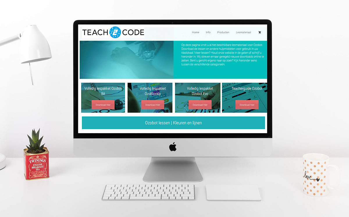
When I began the job, the brand’s website primarily provided information to the educational market. However, it was outdated and lacked the capability for direct purchasing from us. We used resellers for this. We quickly established that we needed to invest time to upgrade the website and making it possible for people to purchase directly from us.
It was an exciting project to work on, as we reshaped all the materials to a newer style. This included taking new product images, as the old ones were outdated and didn’t include all the products. This was a big job as we had 18 different educational kits. That said, I went to work and shot all the imagery we needed. With a bit of editing, I was able to give our kits a new-look in just a matter of weeks. I personally rewrote all the product texts to ensure they aligned perfectly with the products we sold.

We overhauled the imagery and copy on the website, activated our online store, and ensured the backend was accurately configured. We updated the website theme, adjusted elements, and were primed for action. The revamped website became more user-friendly, resulting in a steady stream of orders.
TEACHING MATERIALS
Our educational robots, featured in our kits, served as the primary source of our business. However, the main selling point were all the free teaching materials we created. The lessons all came with a student card that included several tasks and a teacher card that gave more information on how to use the materials. It was a great way to start learning about programming from a very young age.
Once again, we did a big overhaul on the teaching materials. When I started, we had to pack all the different materials ourselves in a big binder. We printed the materials individually on thick and heavy paper, making them durable but also significantly expensive. I gave an alterative which became cheaper for us to print, whilst giving the same quality. I gave a redesign to all our materials and made it into a booklet. It made it easier for teachers to store as it was much thinner, didn’t have a lot of empty space that the binder had, whilst offering a sturdy solution. It was great to have this trust from the boss to make these chances. Over time, we translated our materials to German and slowly started to conquer this market as well.
T2C Educational Materials
PROMOTIONAL MATERIALS
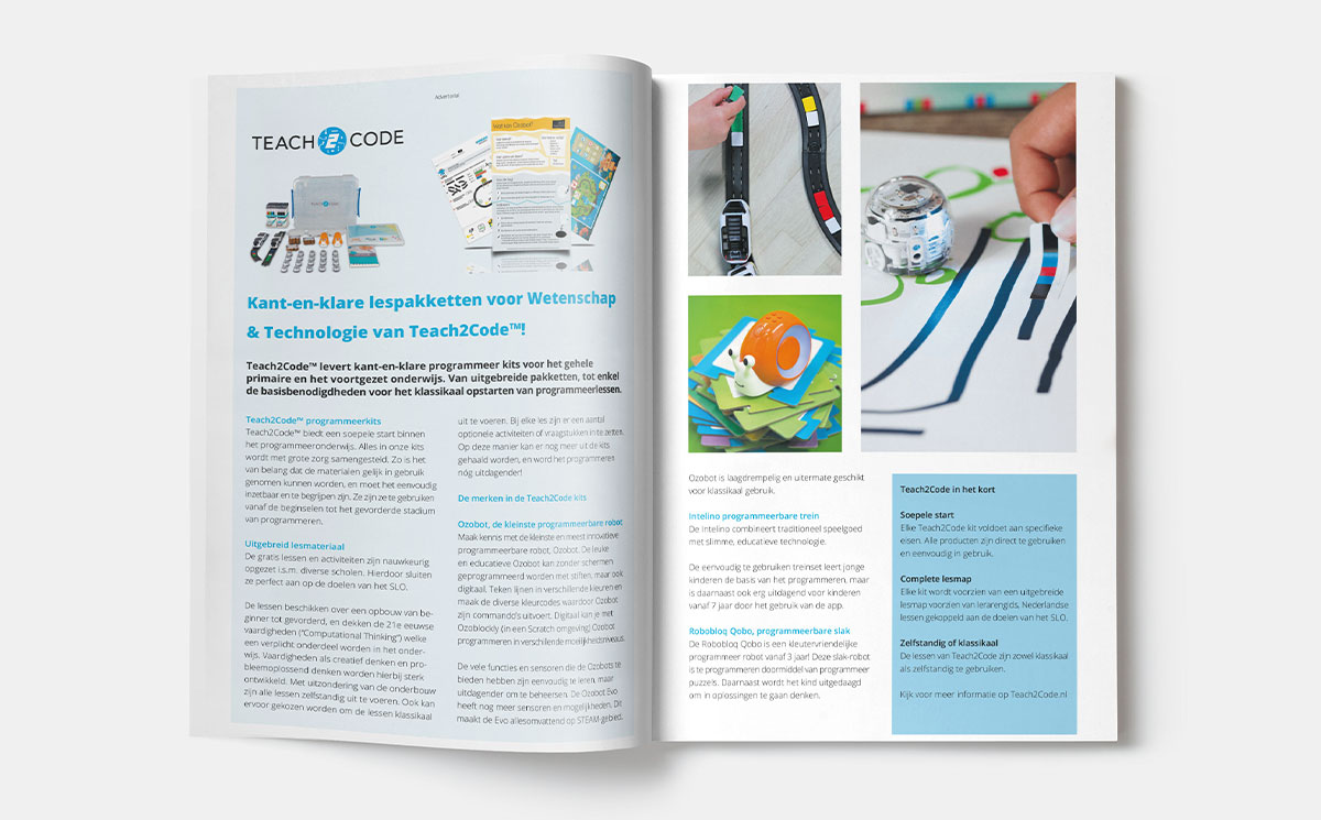
We opted to promote the brand less ourselves, as we were fortunate to have great partners and resellers who did this for us. That said, we did have the chance to write some advertorials for educational magazines on several occasions. By being visible in the educational magazines, we made sure to be visible to the right audience.
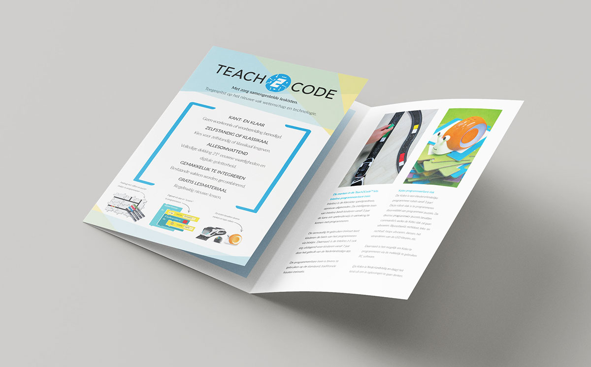
We did offer a great informational flyer to our partners to highlight why our educational product was such a game changer. This was a great flyer to work on as we experimented with different sizes and shapes. In the end, we settled on an A5 trifold flyer.
EXPO BOOTH
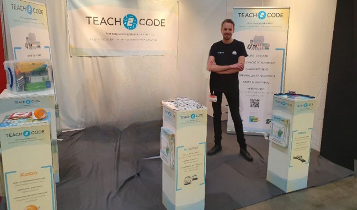
To promote and educate teachers about products and teaching materials, we went to the biggest education expo in the Netherlands called IPON. I had the pleasure of creating our expo booth and all the materials we wanted to show and giveaway. Budget was a big thing to keep in mind whilst planning the expo booth. As a small company, we had to allocate our budget carefully. While for some this might become a challenge, I’m happy to say it added an extra layer of excitement for me. Coming up with innovative ideas to represent our brand in the best way possible was a great opportunity.
It worked out perfect, as our small booth had a central location. We went for an open plan, which made it easy for people to come inside the booth. Creating pillars and decorating these with stickers and flyers holders made it a very popular place for people to interact with our products and to ask questions. The expo was a big success and a great way to interact with current, and new potential customers.
See my full portfolio here.
