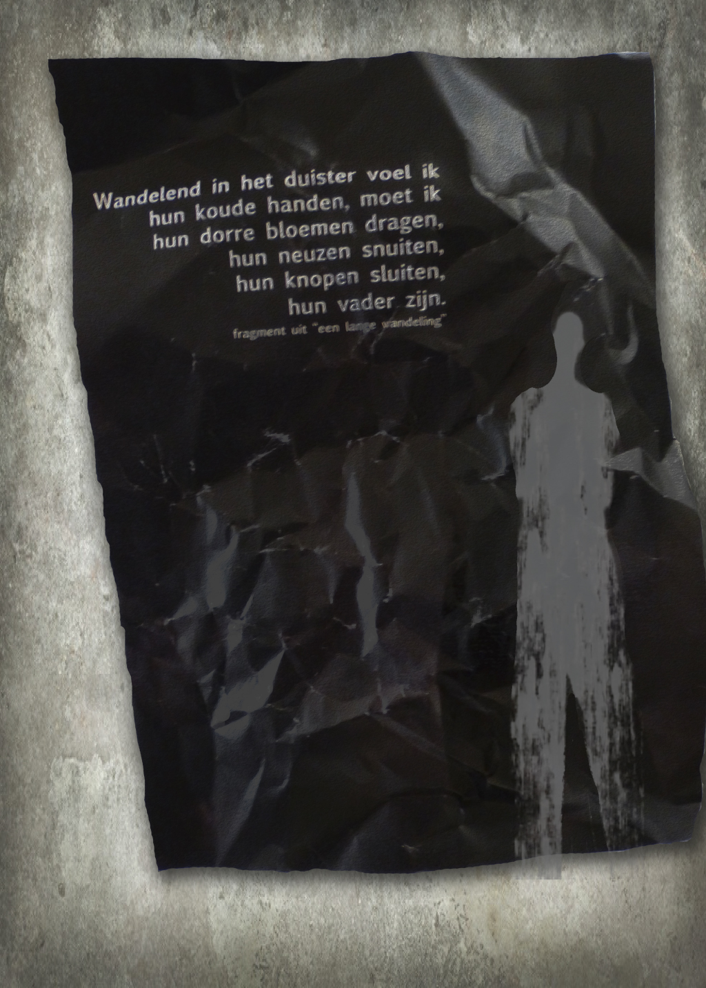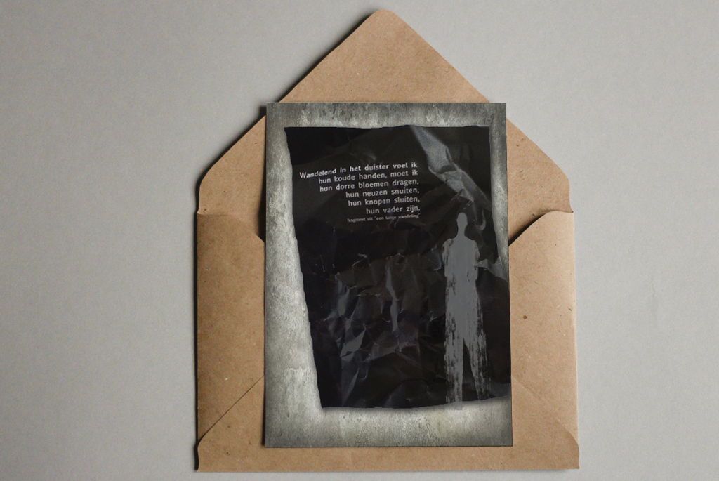
Whilst studying graphic design at the Deltion College in the Netherlands, we were faced with a variety of different tasks. One of these tasks included creating a poem poster, which I really enjoyed making.
MATERIALS
Create a poster in which the image and text reinforce each other. That was the main briefing from this project.
The technique to design the poster was free, however the image had to be catchy and surprising in realization. In the first sketching phase, I tried to look at many different aspects, but seemed to struggle. However, while walking outside, this incredible dried up sand that was torn apart catched my eye. I really loved this and went back home to grab my camera. The texture and the feeling of the sand was something I loved, and so I used it subtle in the background. I combined illustrations, with photoshop, text and came to a design I was happy with.
I’m happy with how this poem poster designed turned out. Furthermore, I like the mixture of materials that give the poster this rawness and unpolished look and feel. The idea to have the legs extend of the figure extend the black space gives this haunting and dark vibe, which really works with the poem’s paragraph.
THE POEM
The Dutch poem I worked with:
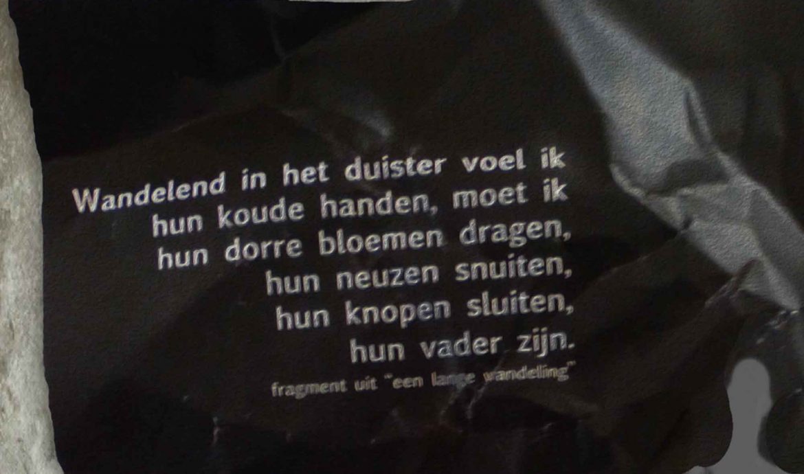
Wandelend in het duister voel ik
hun koude handen, moet ik
hun dorre bloemen dragen,
hun neuzen snuiten,
hun knopen sluiten,
hun vader zijn.[/su_quote]
Quote from “een lange wandeling”
